CSS (Cascading Style Sheets) is a powerful language used to style and format web pages. It allows developers to control the layout, colors, fonts, and spacing of HTML elements, making web pages visually appealing and user-friendly. In this comprehensive guide, we’ll cover everything you need to know about CSS, from basic concepts to advanced techniques, with plenty of code examples.
Table of Contents
- Introduction to CSS
- What is CSS?
- Why is CSS Important?
- How to Link CSS to HTML
- CSS Selectors
- Universal Selector
- Type/Element Selector
- Class Selector
- ID Selector
- Attribute Selector
- Group Selector
- Descendant Selector
- Pseudo-classes and Pseudo-elements
- CSS Box Model
- Components of the Box Model
- Margin vs Padding
- Box-Sizing Property
- CSS Layout
- Position Property (Static, Relative, Absolute, Fixed, Sticky)
- Float and Clear
- Display Property (Block, Inline, Inline-Block, Flex, Grid)
- CSS Flexbox
- Flex Container and Flex Items
- Flex Direction
- Justify-Content and Align-Items
- Flex Wrap and Align-Content
- CSS Grid
- Grid Container and Grid Items
- Grid Template Columns and Rows
- Grid Areas
- Grid Gap and Alignment
- CSS Typography
- Font Properties (Font-Family, Font-Size, Font-Weight, Font-Style)
- Text Alignment and Decoration
- Text Shadow and Transform
- CSS Colors and Backgrounds
- Color Properties (Hex, RGB, RGBA, Named Colors)
- Background Properties (Background-Color, Background-Image, Background-Position, Background-Size, Background-Repeat)
- Gradient Backgrounds
- CSS Transitions and Animations
- Transition Properties (Transition-Duration, Transition-Timing-Function, Transition-Delay)
- Keyframes and Animation Properties
- CSS Transforms
- 2D Transforms (Translate, Rotate, Scale, Skew)
- 3D Transforms (RotateX, RotateY, TranslateZ)
- Transform-Origin and Backface-Visibility
- Responsive Design
- Media Queries
- Viewport Meta Tag
- Responsive Images (Srcset and Sizes)
- Advanced CSS Concepts
- CSS Variables
- CSS Filters
- CSS Blend Modes
- CSS Custom Properties
1. Introduction to CSS
What is CSS?
CSS stands for Cascading Style Sheets. It is a language used to style and format the appearance of web pages written in HTML and XML. CSS controls how elements are displayed on the screen, including layout, colors, fonts, and spacing.
Why is CSS Important?
- Separation of Concerns: CSS separates the content (HTML) from the presentation (styling), making it easier to maintain and update.
- Consistency: CSS allows you to apply consistent styles across multiple pages.
- Responsive Design: CSS enables you to create layouts that adapt to different screen sizes and devices.
How to Link CSS to HTML
You can link a CSS file to an HTML document using the <link> element in the <head> section:
<!DOCTYPE html>
<html lang="en">
<head>
    <meta charset="UTF-8">
    <meta name="viewport" content="width=device-width, initial-scale=1.0">
    <title>Document</title>
    <link rel="stylesheet" href="styles.css">
</head>
<body>
    <h1>Hello, World!</h1>
</body>
</html>
Run HTML
2. CSS Selectors
Universal Selector
The universal selector (*) selects all elements on the page.
* {
    margin: 0;
    padding: 0;
}
Type/Element Selector
The type selector selects all elements of a specific type, such as <h1> or <p>.
h1 {
    color: blue;
}
Class Selector
The class selector selects elements with a specific class attribute. It is denoted by a dot (.).
.btn {
    background-color: green;
}
<button class="btn">Submit</button>
Run HTML
ID Selector
The ID selector selects a single element with a specific ID attribute. It is denoted by a hash (#).
#para {
    font-size: 20px;
}
<p id="para">This is a paragraph.</p>
Run HTML
Attribute Selector
The attribute selector selects elements based on the presence or value of an attribute.
a[title] {
    font-size: 2em;
}
<a href="#" title="xyz">Click</a>
Group Selector
The group selector allows you to apply the same styles to multiple elements at once.
h1, h2 {
    background-color: grey;
}
<h1>Java is Programming</h1>
<h2>Java is Secure</h2>
Descendant Selector
The descendant selector selects elements that are descendants of another element.
div p {
    color: red;
}
<div>
    <p>This is a paragraph.</p>
</div>
Pseudo-classes and Pseudo-elements
Pseudo-classes select elements based on their state, while pseudo-elements select specific parts of an element.
a:hover {
    color: red;
}

p::first-letter {
    font-size: 200%;
    color: red;
}
3. CSS Box Model
Components of the Box Model
The CSS box model consists of four parts:
- Content: The actual content of the element.
- Padding: The space between the content and the border.
- Border: The border surrounding the padding and content.
- Margin: The space outside the border, separating the element from other elements.
.box {
    width: 200px;
    padding: 20px;
    border: 5px solid black;
    margin: 10px;
}
Margin vs Padding
- Margin: Space outside the element’s border.
- Padding: Space inside the element’s border.
.box {
    margin: 20px; /* Space outside */
    padding: 10px; /* Space inside */
}
Box-Sizing Property
The box-sizing property defines how the total width and height of an element are calculated.
.box {
    box-sizing: border-box; /* Includes padding and border in the element's total width and height */
}
4. CSS Layout
Position Property
The position property determines how an element is positioned in the document.
.static {
    position: static; /* Default positioning */
}

.relative {
    position: relative; /* Positioned relative to its normal position */
    top: 10px;
    left: 20px;
}

.absolute {
    position: absolute; /* Positioned relative to the nearest positioned ancestor */
    top: 50px;
    left: 50px;
}

.fixed {
    position: fixed; /* Positioned relative to the viewport */
    top: 0;
    left: 0;
}

.sticky {
    position: sticky; /* Sticks to the viewport when scrolling */
    top: 0;
}
Float and Clear
The float property allows elements to float to the left or right within their container.
img {
    float: left;
}

.clear {
    clear: both; /* Clears floats */
}
Display Property
The display property defines how an element is displayed.
.block {
    display: block; /* Takes up the full width */
}

.inline {
    display: inline; /* Takes up only as much width as necessary */
}

.inline-block {
    display: inline-block; /* Combines block and inline properties */
}

.flex {
    display: flex; /* Flexbox layout */
}

.grid {
    display: grid; /* Grid layout */
}
5. CSS Flexbox
Flex Container and Flex Items
Flexbox is a layout model that allows you to align and distribute space among items in a container.
.container {
    display: flex;
    justify-content: center; /* Aligns items along the main axis */
    align-items: center; /* Aligns items along the cross axis */
}
Flex Direction
The flex-direction property defines the direction of the main axis.
.container {
    flex-direction: row; /* Default: left to right */
    flex-direction: column; /* Top to bottom */
}
Justify-Content and Align-Items
justify-content: Aligns items along the main axis.align-items: Aligns items along the cross axis.
.container {
    justify-content: space-between; /* Distributes space between items */
    align-items: center; /* Centers items vertically */
}
Flex Wrap and Align-Content
flex-wrap: Allows items to wrap onto multiple lines.align-content: Aligns multiple lines of items.
.container {
    flex-wrap: wrap; /* Allows wrapping */
    align-content: space-around; /* Distributes space around lines */
}
6. CSS Grid
Grid Container and Grid Items
CSS Grid is a two-dimensional layout system that allows you to create complex layouts.
.container {
    display: grid;
    grid-template-columns: 1fr 2fr 1fr; /* Defines three columns */
    grid-template-rows: 100px 200px; /* Defines two rows */
}
Grid Template Columns and Rows
The grid-template-columns and grid-template-rows properties define the size and number of columns and rows.
.container {
    grid-template-columns: repeat(3, 1fr); /* Three equal columns */
    grid-template-rows: 100px auto; /* Two rows */
}
Grid Areas
You can define grid areas using the grid-template-areas property.
.container {
    grid-template-areas:
        "header header header"
        "sidebar content content"
        "footer footer footer";
}

.header {
    grid-area: header;
}

.sidebar {
    grid-area: sidebar;
}

.content {
    grid-area: content;
}

.footer {
    grid-area: footer;
}
Grid Gap and Alignment
The gap property defines the spacing between rows and columns.
.container {
    gap: 10px; /* 10px gap between rows and columns */
}
7. CSS Typography
Font Properties
CSS provides several properties to control the appearance of text.
h1 {
    font-family: "Arial", sans-serif;
    font-size: 2rem;
    font-weight: bold;
    font-style: italic;
}
Text Alignment and Decoration
You can align text and add decorations using the text-align and text-decoration properties.
p {
    text-align: center; /* Centers text */
    text-decoration: underline; /* Underlines text */
}
Text Shadow and Transform
The text-shadow property adds a shadow to text, while text-transform changes the case of text.
h1 {
    text-shadow: 2px 2px 5px rgba(0, 0, 0, 0.3); /* Adds a shadow */
    text-transform: uppercase; /* Converts text to uppercase */
}
8. CSS Colors and Backgrounds
Color Properties
CSS allows you to define colors using various formats.
p {
    color: #ff5733; /* Hex color */
    color: rgb(10, 25, 255); /* RGB color */
    color: rgba(10, 25, 255, 0.5); /* RGBA color with transparency */
    color: red; /* Named color */
}
Background Properties
You can set background colors, images, and positions using CSS.
 {
    background-color: lightblue; /* Background color */
    background-image: url('image.jpg'); /* Background image */
    background-position: center; /* Centers the background image */
    background-size: cover; /* Scales the image to cover the entire element */
    background-repeat: no-repeat; /* Prevents the image from repeating */
}
Gradient Backgrounds
CSS allows you to create gradient backgrounds using the linear-gradient function.
body {
    background: linear-gradient(to right, red, yellow); /* Gradient background */
}
9. CSS Transitions and Animations
Transition Properties
CSS transitions allow you to animate changes to CSS properties.
.button {
    transition: background-color 0.5s ease-in-out; /* Animates background color */
}

.button:hover {
    background-color: blue; /* Changes background color on hover */
}
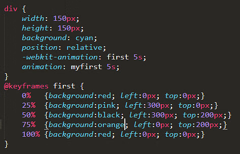
Keyframes and Animation Properties
CSS animations allow you to create complex animations using keyframes.
@keyframes slide {
    0% { transform: translateX(0); }
    100% { transform: translateX(100px); }
}

.box {
    animation: slide 2s ease-in-out infinite; /* Applies the slide animation */
}
10. CSS Transforms
2D Transforms
CSS transforms allow you to rotate, scale, skew, and translate elements.
.box {
    transform: rotate(45deg); /* Rotates the element */
    transform: scale(1.5); /* Scales the element */
    transform: skew(20deg, 10deg); /* Skews the element */
    transform: translate(50px, 100px); /* Moves the element */
}
3D Transforms
CSS also supports 3D transforms, allowing you to manipulate elements in three-dimensional space.
.box {
    transform: rotateX(45deg) rotateY(30deg); /* Rotates the element in 3D space */
}
Transform-Origin and Backface-Visibility
The transform-origin property defines the point around which a transformation is applied, while backface-visibility controls whether the back face of an element is visible.
.box {
    transform-origin: top left; /* Rotates around the top-left corner */
    backface-visibility: hidden; /* Hides the back face */
}
11. Responsive Design
Media Queries
Media queries allow you to apply styles based on the screen size or device characteristics.
@media only screen and (max-width: 600px) {
    body {
        background-color: lightblue; /* Changes background color on small screens */
    }
}
Viewport Meta Tag
The viewport meta tag ensures that the web page is rendered correctly on all devices.
<meta name="viewport" content="width=device-width, initial-scale=1.0">
Responsive Images
You can create responsive images using the srcset and sizes attributes.
<img srcset="small.jpg 300w, medium.jpg 768w, large.jpg 1200w"
     sizes="(max-width: 600px) 300px, (max-width: 1200px) 768px, 1200px"
     src="default.jpg" alt="Responsive Image">
12. Advanced CSS Concepts
CSS Variables
CSS variables allow you to define reusable values.
:root {
    --primary-color: blue;
}

.box {
    background-color: var(--primary-color); /* Uses the CSS variable */
}
CSS Filters
CSS filters allow you to apply visual effects like blur, brightness, and contrast.
img {
    filter: blur(5px); /* Blurs the image */
}
CSS Blend Modes
CSS blend modes allow you to blend elements together.
.blend {
    background-blend-mode: multiply; /* Multiplies the background layers */
}
CSS Custom Properties
CSS custom properties allow you to define reusable values that can be used throughout your stylesheet.
:root {
    --main-color: #ff5733;
}

.box {
    background-color: var(--main-color); /* Uses the custom property */
}